Yes. They did indeed Build from here.
How small but mighty Mills42 FCU changed their trajectory.
We were introduced to Mills42 (at the time, M/A-Com FCU) via a phone call in late 2012 from their CEO, Carla Rasetta. During the call, Carla expressed her frustration with the firm she had originally hired to rebrand the credit union.
At the time, the credit union was facing a serious identity crisis. M/A-Com had pulled most of their operations out of the region, along with most of the high-income, white-collar employees who had comprised the credit union’s core membership. Rather than panicking at this turn of events, they realized they had been presented the perfect opportunity to recast the credit union’s mission by transitioning their focus to the underserved, lower income residents of Greater Lowell—many of whom are first- or second-generation immigrants. A very risky decision for such a small credit union, but this passion to help those individuals who need it the most has always been in their DNA.
They next looked to rebrand the credit union, and in this case, that involved a name change. Unfortunately, the firm Carla had originally hired to accomplish this had simply presented her with a list of 25 potential names, and she was told to, “pick one.” That would become their new name and the brand would be designed around it.
This is the antithesis of how Raoust+Partners works—and Carla knew that. Our previous rebrand of Jeanne D’Arc Credit Union, also headquartered in Lowell, had led them to achieve outstanding results, so with blessings from Jeanne D’Arc’s CEO, Carla gave us a call.
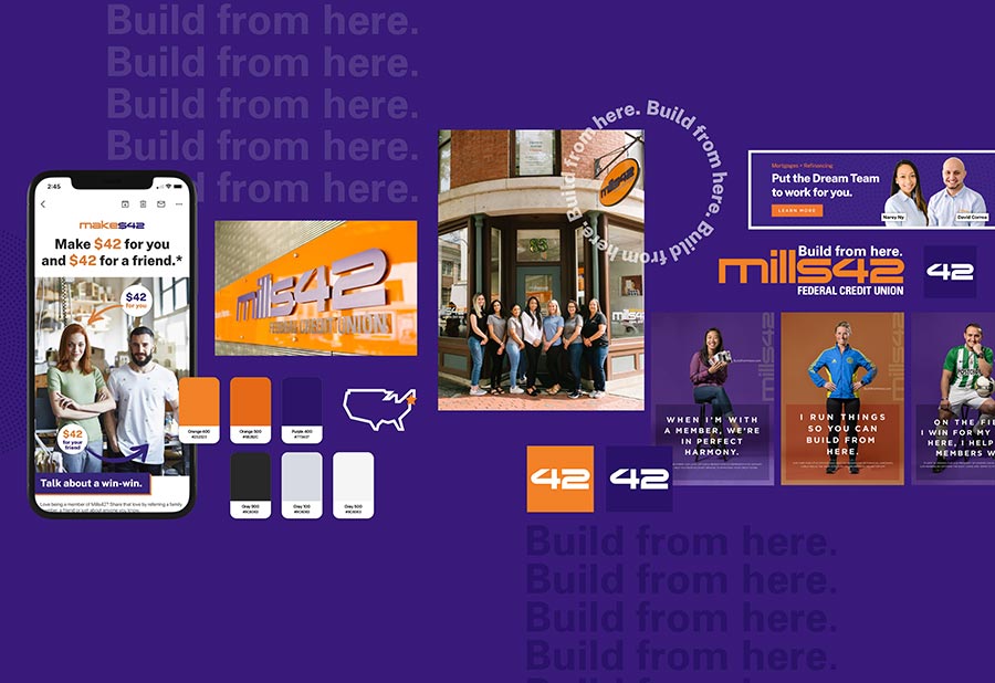
Over the next months, we went to work: mined what was unique and profoundly special about this small $14 million credit union. Pulling back the curtains (literally), M/A-Com FCU became Mills42 FCU—projecting a highly retail-oriented personality, accomplished with a more modern take on the mill heritage of Lowell with an element of curiosity, which the number “42” signifies.
To reinforce the credit union’s mission, the brand position, Build from here, immediately identifies what Mills42 is all about—weaving in the textile manufacturing heritage of Lowell, as well as defining how the credit union will help its members build/rebuild credit.
A palette of purple and orange was picked to reflect the colorful mosaic of ethnicities in Lowell—Portuguese, Cambodian, Hispanic, Indian, etc., cultures informed this vivid use of color. As a backdrop, the second largest folk festival in the country, the Lowell Folk Festival, is held yearly in downtown Lowell, right where Mills42 FCU is located.
From a visual perspective, the design language revolves around the use of local photographers featuring iconic imagery of a proud industrial past constantly evolving through revitalization and rebirth. The story of Mills42 is indeed the story of Lowell: proud to build on its heritage and strong foundations.
This rebrand has since resonated throughout Lowell’s richly diverse, deeply historic community. The credit union has virtually doubled its asset size to nearly $26 million and has grown their net worth by 44%. As impressive is their negligible loan delinquency ratio, which is not what you would expect with a focus on low-income, unbanked individuals.
Build from here, indeed.