Grab attention. Gain conversions.
One smart way forward to sustained growth.
Our relationship with Jeanne D’Arc Credit Union, headquartered in Lowell, MA, began in late 2008 with a comprehensive rebrand of the then $700-million credit union. Twelve years later, they have well over doubled in size, and our partnership has graced us with a spectrum of richly diverse, multi-faceted and often delightfully interesting (and challenging) projects.
So, you can imagine that we were really jazzed when they came to us to develop the brand for a new savings account they planned to launch January 1, 2021.
Bit of background into the account itself:
Jeanne D'Arc was looking to add a prize-based savings account to their product suite but did not want to develop/manage the back-end functionality. After researching available options, they decided on the WINcentive® program, based in Minnesota. Critical point here: They made sure they were able to white-label this product as their own.
Jeanne D’Arc is the first credit union to offer a prize-based savings account in Massachusetts, and they wanted to make a big splash with it.
How we went about developing the brand:
In the initial discussions with Jeanne D’Arc’s VP Marketing & Financial Education, the consensus was to do something dynamic and fun. That led to looking at how lotteries tend to promote their games and scratchers, and that led to how this new savings account could be positioned as the win-win “non-gamble” with your money. You make deposits into the account, and you could win a monthly prize (there are also quarterly and annual prizes). But even if you don't win that month, you’re now in the habit of saving money regularly—building a strong financial base for yourself. And that is how the brand WinStrong was born. We should note here that back in 2010, we had developed a brand for Jeanne D’Arc’s financial education program, called MoneyStrong, that is still in use today. So, this tie-in to a well-established, extremely successful program is a bonus.
Headlines used in the launch campaign like, "Save Big. Win Bigger!" and "A chance to win. A reason to save." support and reinforce the brand.
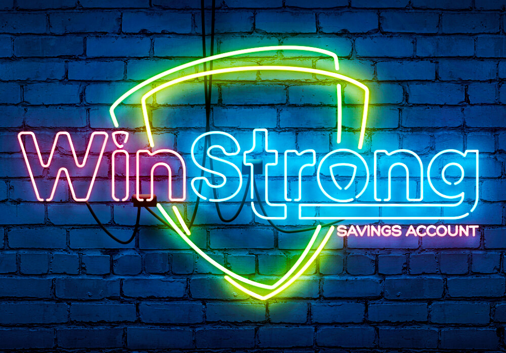
How we developed the WinStrong brand iconography:
This account needed to stand out—and in a big way. Thus, the use of neon for the Jeanne D’Arc shield logo, WinStrong logo and campaign headline(s) with their vivid, eye-catching colors accomplish this mission. These elements were then juxtaposed against darker backgrounds to highlight the glow they emit. Video ads we’ve produced for paid social media campaigns show off the brand in its best “light,” and we invite you to see how below.
Why we are telling you this:
In our world, you ask 100 credit union marketers what their definition of “brand” is, and most of them are going to tell you that it pertains to the overarching identity and purpose of the credit union itself. Of course. But in this increasingly crowded financial services marketplace, there still does exist extraordinary opportunities to gain traction and grow rather aggressively by either creating a product or repackage an existing product so that it is a unique, dynamic and engaging brand in and of itself.
The result is that it will absolutely stand out in that fiercely contested marketplace. And standing out equates to attracting attention, which leads to conversions. For a small financial institution (and what credit union is not small, compared to the “big guys”), this is absolutely a (if not the) way forward to sustained growth.