No orphans. No orphans. No orphans.

Considering the experience of your users in every facet your brand touches.
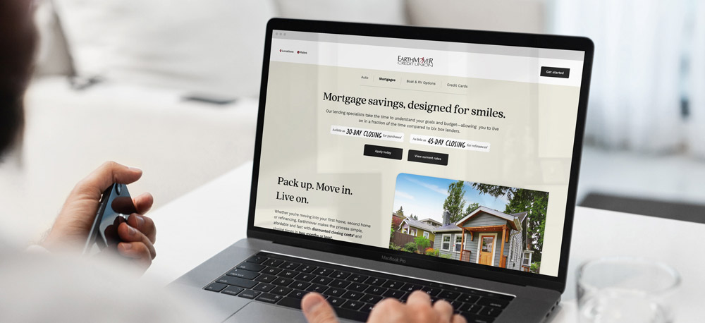
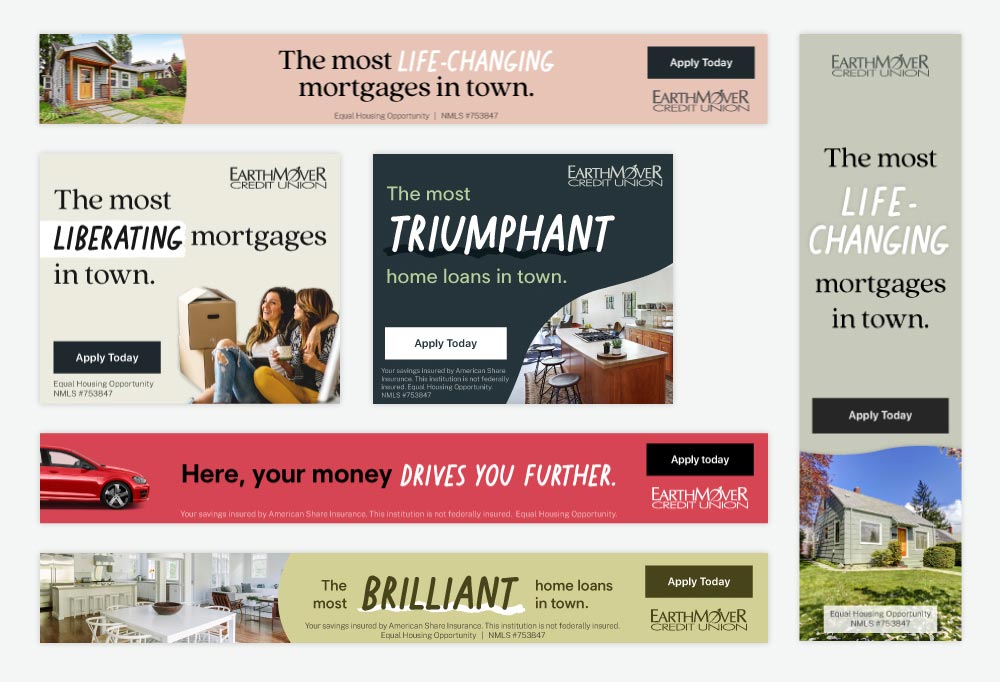
From a logo to a website to coordinated media buys and brand design, the visual language of design ought to be one of the guiding forces behind every decision in a cohesive brand strategy. What may look like a simple update to a logo or a website "refresh" may in fact entail a holistic evaluation of what each element means in relation to all other pieces of creative, as well as the mission, of your credit union. When building brands to campaigns, it’s important to consider every single touchpoint.
We asked Jeremiah Lewis, our Lead Developer, and Miles Quillen, Senior Designer, to discuss the importance of cohesive design.

Jeremiah: The choices behind a cohesive visual strategy extend far. When we evaluate a project, we approach it from every angle; we think about the effects of an individual campaign within the context of the brand and what that means to consumers, whether they be members of the credit union, prospects or even random foot traffic passing by a window display.
Miles: Exactly. You have to consider the multitude of perspectives that are going to see the work. Whether it’s a Facebook ad or an in-branch video, each person is coming at it from a different context and mindset. You need to design for them all and keep the work cohesive.
Jeremiah: Colors, fonts, spacing, and certainly imagery, are guiding principles that can easily be pointed to, but there are other subtle data points to be considered. Does the website work properly on mobile, tablet and desktop? It should be a given that the answer must be yes. But does it pass the Americans with Disabilities Act (1990) guidelines and recommendations? While the former is an obvious nod to increasing usability, the latter is just as important, as it encapsulates Raoust+Partner's holistic design philosophy: no orphans, and that includes thinking about the experience of every single user!
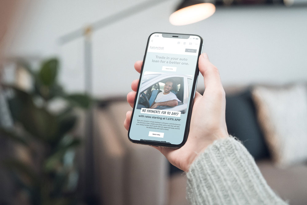
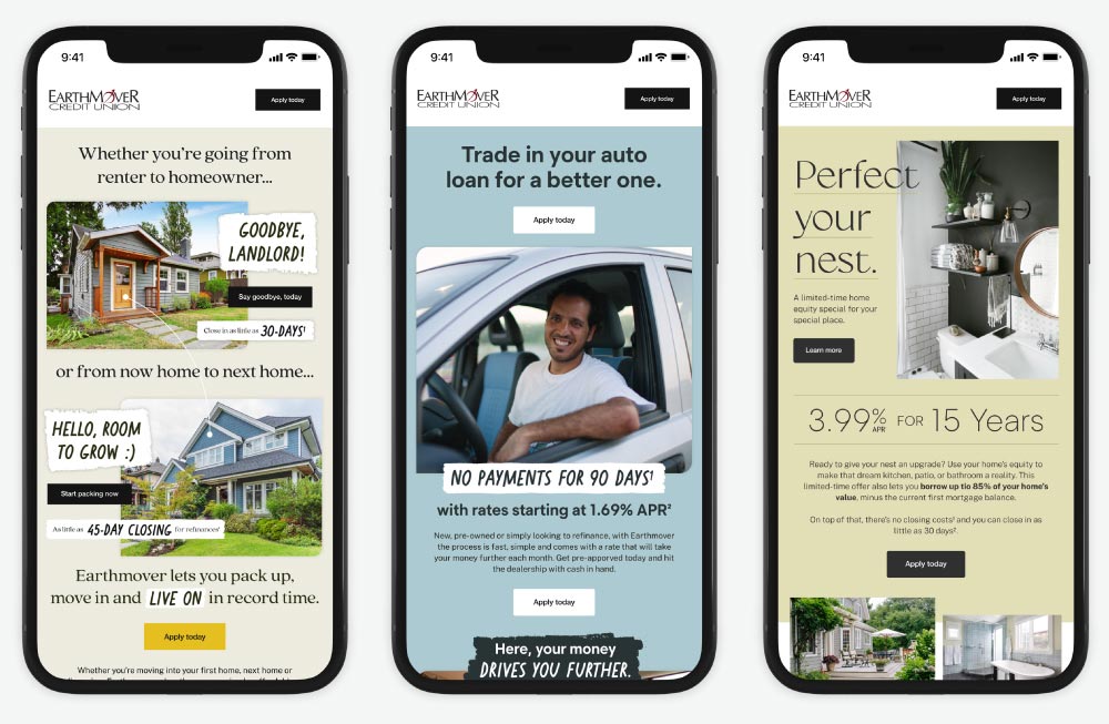
Miles: By no orphans, we mean that your brand, regardless of its depth, should be considered and implemented in every aspect available. Those colors, fonts and imagery that Jeremiah mentioned should be prevalent and immediately recognizable in all of your emails, for example. By considering all touchpoints, you blanket your credit union in a consistent look which goes a long way with your audience—both members and non-members.


Jeremiah: The process by which a particular piece of the brand puzzle is shaped and built involves dozens, if not hundreds, of hours and team collaboration, often to effect seemingly insignificant choices. Does it matter if that color doesn't quite meet ADA requirements? Yes! For us, design is inclusive and an invitation to all people. And when we create inclusive designs and build brand strategies with the mindset that every piece, no matter how small, is vital to the success of the whole, we push ourselves and our clients to greater heights.
Miles: Inclusive brands simply look better. They feel better. They are brands that we want to be a part of and interact with. They are brands that time and time again, we as humans recognize, often subconsciously. This happens because the colors, fonts, imagery and design elements are carefully considered on each and every item.
To the people who ask why it matters, we say, because every person is important, and every detail counts. How could we do any less?

Jeremiah Lewis
Lead Developer

Miles Quillen
Senior Designer